
Overview
My role
End-to-end design that includes user research, interaction and visual design, prototyping, and usability testing.
Team
1 Designer (Myself)
1 PM
4 Engineers
1 UX Researcher
1 Data Scientist
1 Content Designer
Duration
3 months (Q3 2022)
Platform
Responsive Web
Impact
After the design improvement, there was a 9% increase in select offer rates and an 11% increase in funding rate. 🎉
Context and Project Goal
SoFi's mission is to help people achieve financial independence and realize their ambitions. SoFi offers a financial marketplace product that helps people compare financial products by partnering with top lenders to provide pre-qualified offers. For personal loans, this marketplace experience is available to SoFi members who were unable to obtain a personal loan from SoFi. Since lenders have different criteria for lending money, we provide an easy and quick way to check with other top lenders in less than 5 minutes.
Why personal loan market experience is important?
Big opportunity size: Personal loans generate the most traffic and revenue for our business, and our user base continues to grow during the pandemic.
Improved member experience: We offer alternative loan options in cases where a SoFi personal loan is not available. Since other lenders may have different lending criteria, SoFi members may still receive loan offers from outside sources.
Project Goal
Improve user experience on the PL marketplace to boost offer selection and funding of personal loans.
Research
User Journey
SoFi Personal Loans application: The user begins the SoFi personal loan application by answering a few questions to check the criteria.
Decline & Marketplace intro: The user receives a decline from the SoFi personal loan and is presented with an introduction to the marketplace options.
Marketplace application: The user starts the marketplace application and agrees to consent. Typically, the user will see 1-2 additional questions.
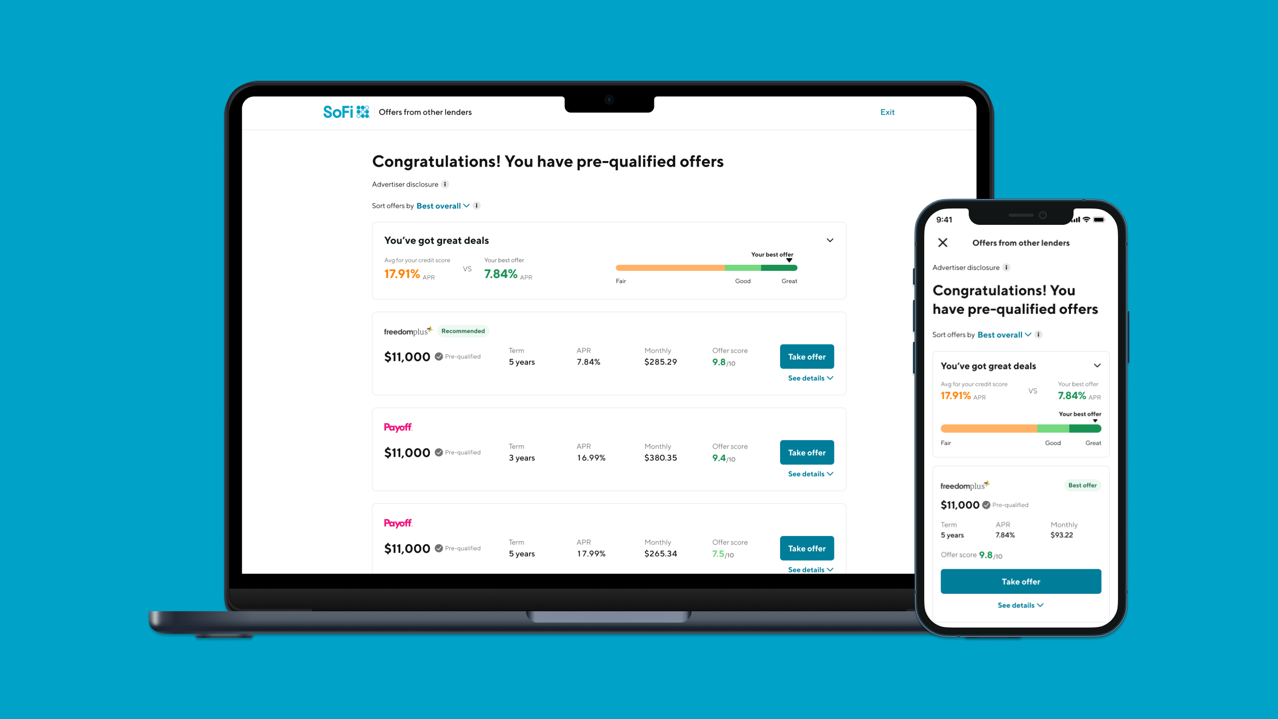
View offers: If the user receives an offer, the offers will be presented.
Pain points
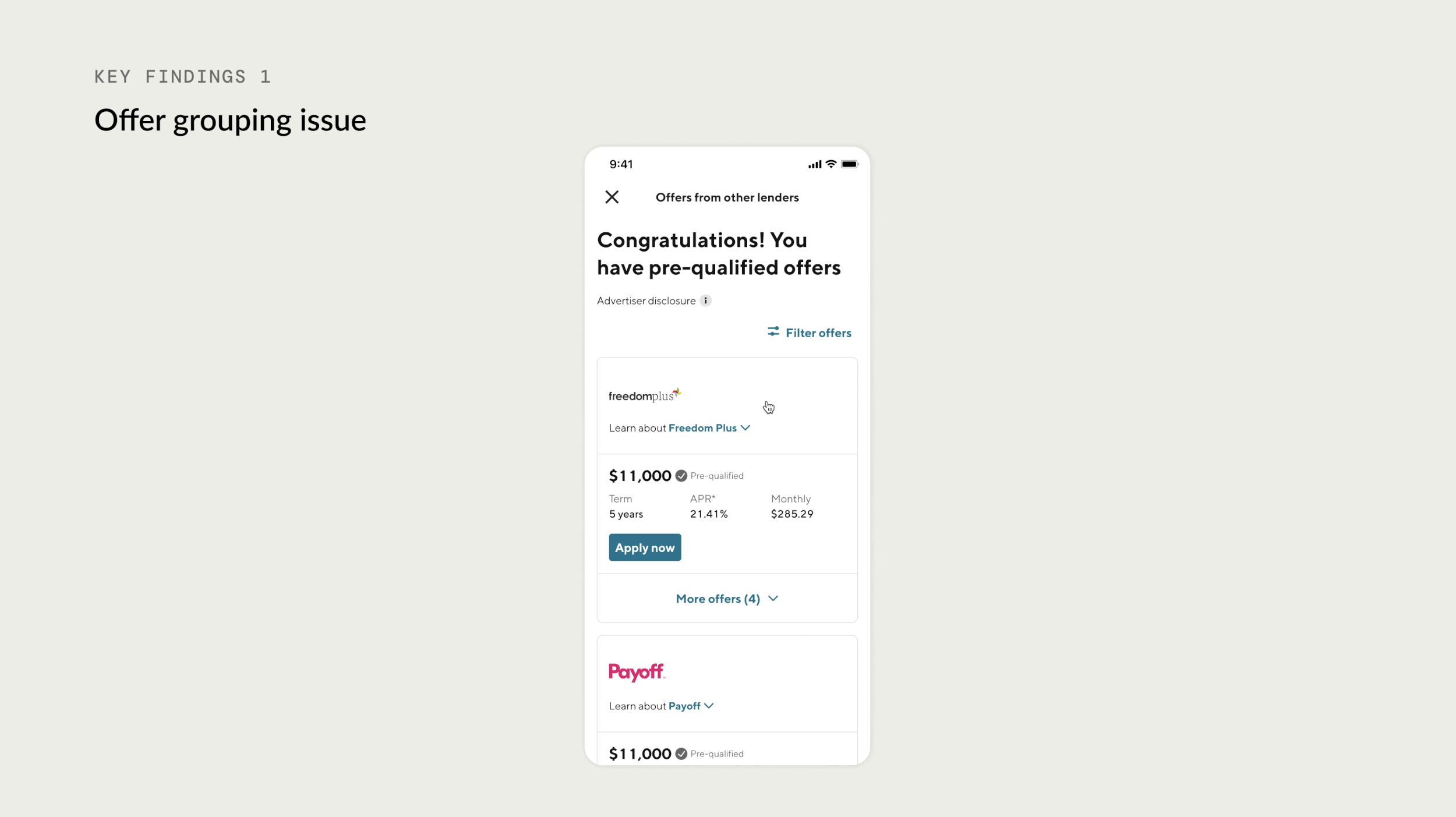
Offer grouping issue: Grouping offers by lenders makes it hard for users to compare. This is particularly difficult when trying to compare APR, which is a top priority for users.
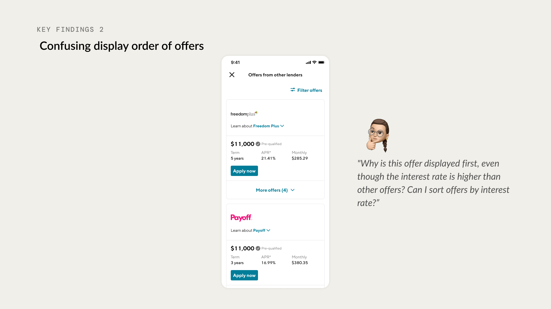
2. Confusing display order of offers: The logic used to display offers from lenders with higher funding rates is causing confusion. Also, the sorting functionality cannot be changed.
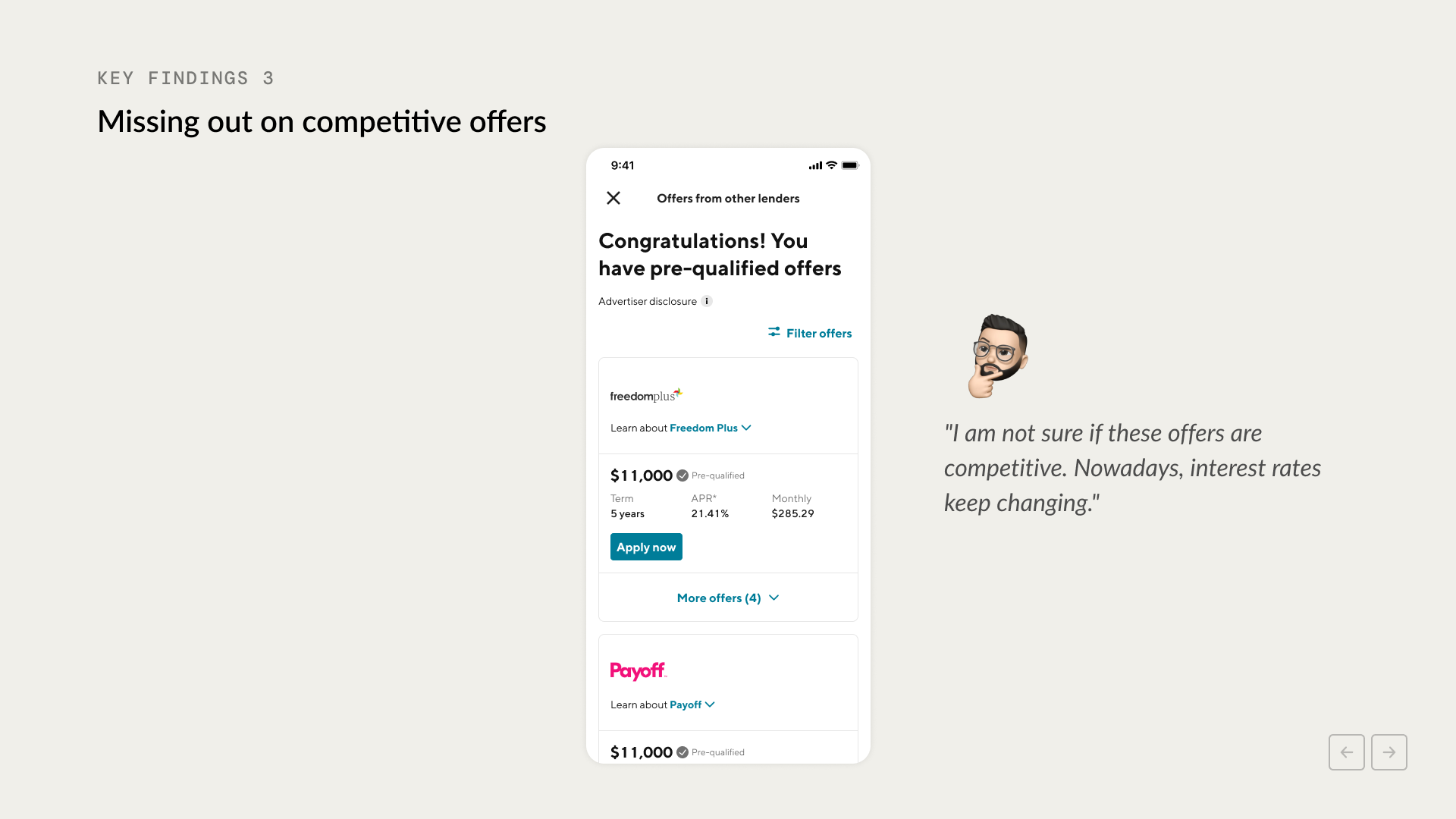
3. Missing out on competitive offers: Fluctuating interest rates may make users unsure if their offers are competitive, causing them to miss out on good offers.
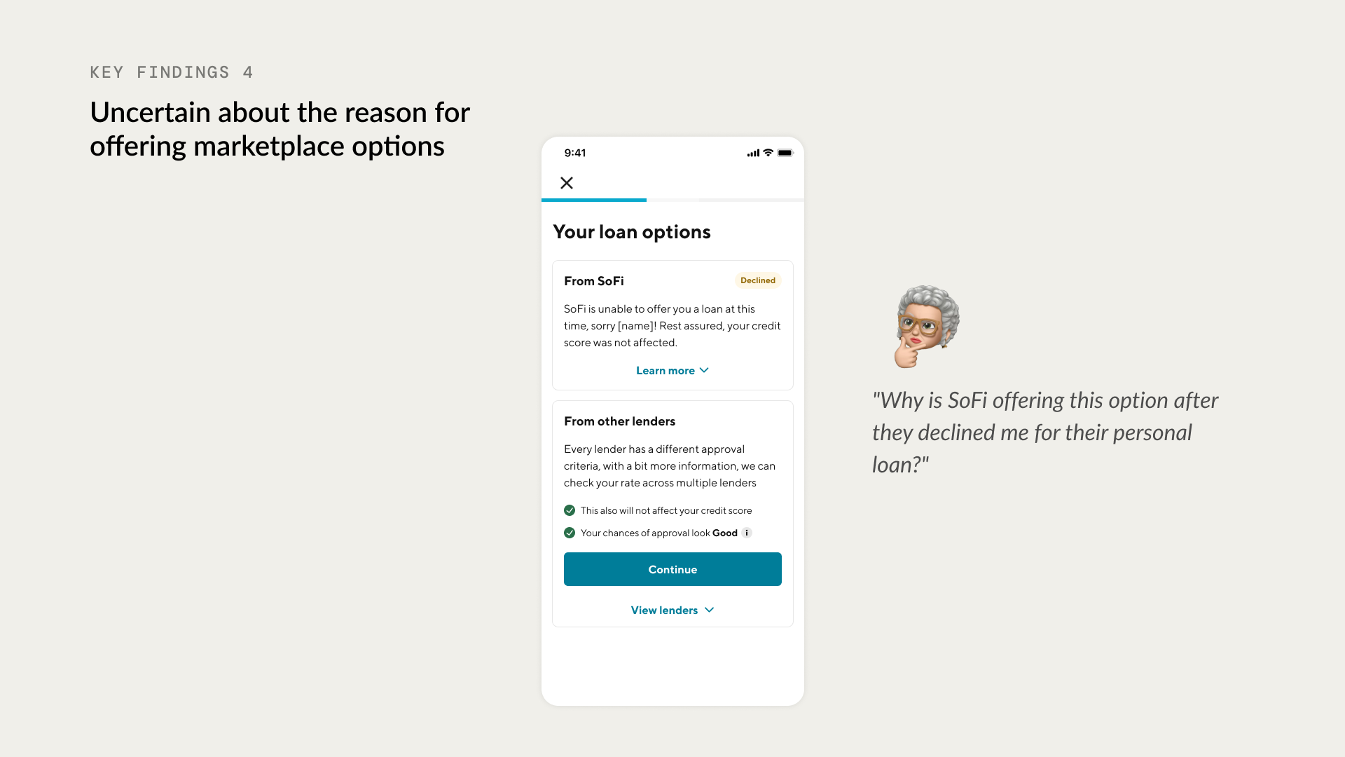
4. Uncertain about the reason for offering marketplace options: Users want to know why SoFi is recommending other lenders when they are unable to provide a personal loan.
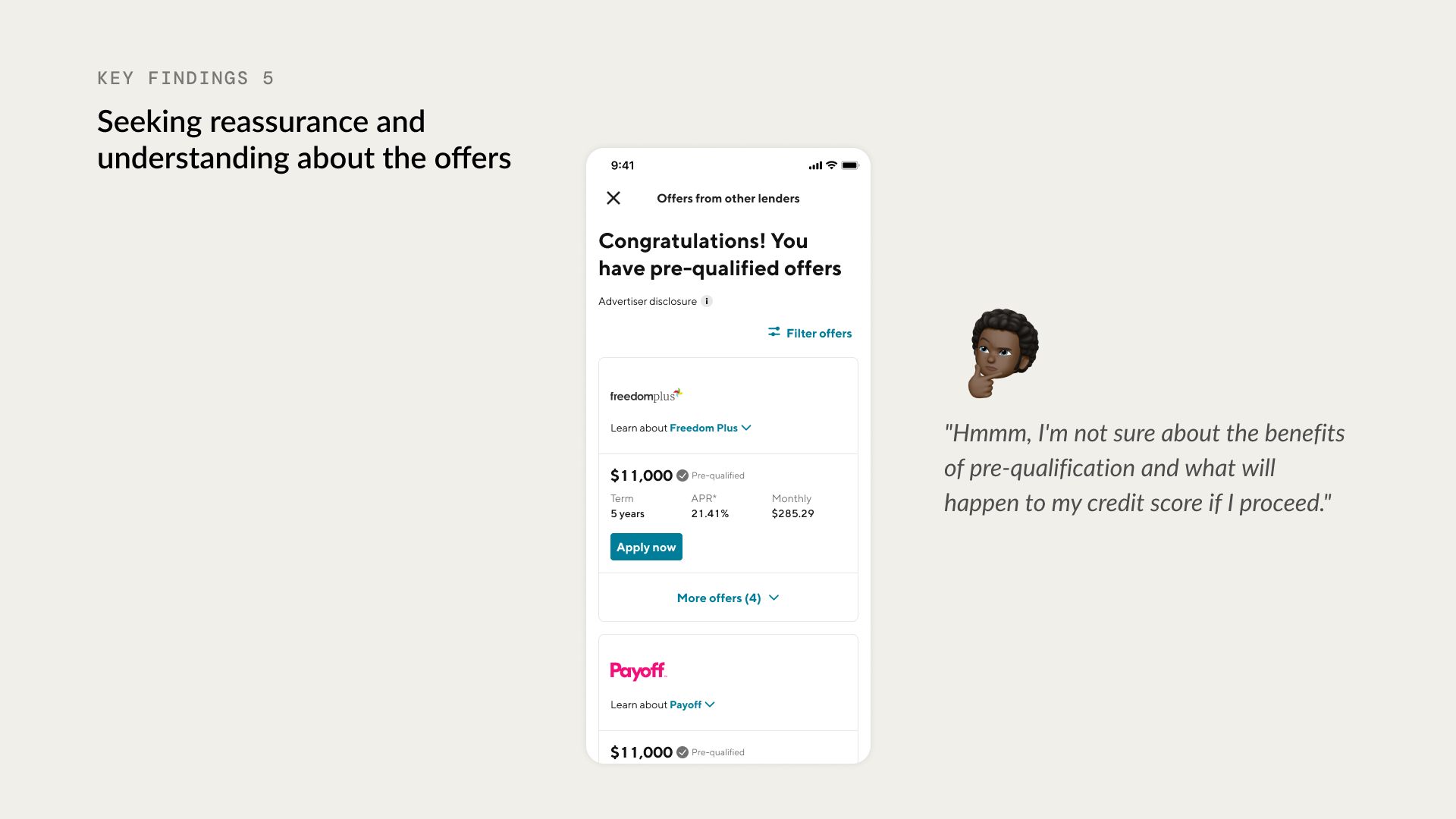
5. Seeking reassurance and understanding about the offers: Users need reassurance about the benefits of pre-qualification and the credit score impact when accepting offers.
Design solutions
After understanding the problem I set up design principles. The new experience will be
🚀 Easy to compare: Presenting information clearly, organizing it, and providing flexible ways to compare offers based on individual interests.
💡 Provide insight: Provide context, explanations, or data to help users understand the offers they received.
✨ Transparency: Provide relevant information to establish user trust and assist users in making informed decisions.
01. Simplify and reduce friction by removing unnecessary questions
We remove the questions to generate personal loans and have only necessary questions to generate SMB offers. In the end, we could reduce more than half of the questions.
02. Building trust and confidence by providing enough context and addressing any user concerns upfront will help users kick start the funnel
From the user research, I found out that when the users go through this kind of loan funnel they are concerned about
Their impact on the credit score
Data safety
Data sharing with 3rd party
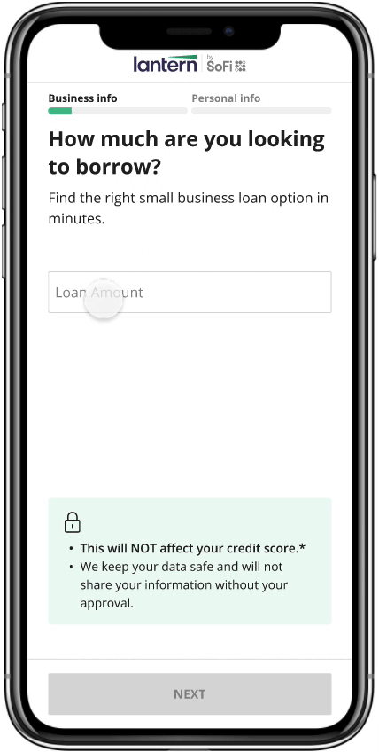
On the screen, I display answers for those user concerns so they can start the funnel with peace of mind. In addition, I improve the question tone more personable tone and I’m clear about how the user should answer (exact value VS estimation)
03. Clear and straightforward interaction will help users to go through the funnel quickly and easily
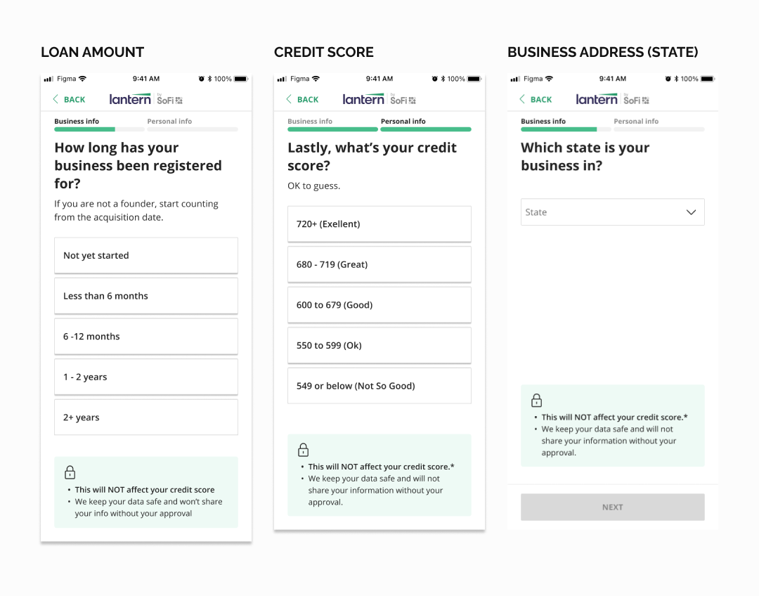
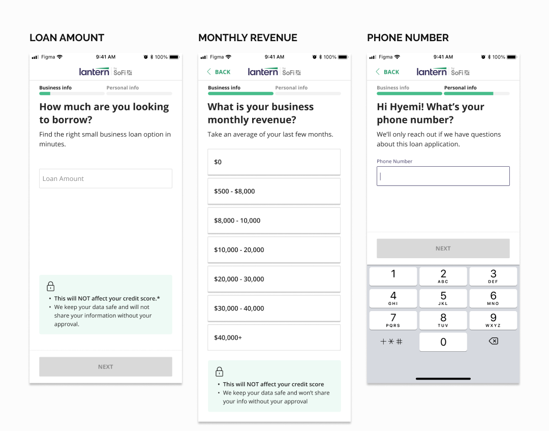
The Majority of Lantern users use their mobile phones to go through the funnel, and typing text fields with the phone is tedious work. I worked with our PM and engineers to find a way to provide a range instead of a specific value. In addition, we only ask for necessary information (ex full business address VS just state info). Furthermore, I get rid of the $ amount slider from the funnel to reduce the chance of receiving inaccurate data.
Impact
After the design improvement, there was a 9% increase in select offer rates and an 11% increase in funding rate. 🎉
Thanks for reading my case study!