

Overview
My role
End-to-end design that includes user research, interaction and visual design, prototyping, and usability testing.
Team
1 Designer (myself)
5 Engineers
1 Product Manager
1 UX Researcher
1 Content Writer
Duration
3 months (July to September 2021)
Platform
Responsive Web
Impact
After the design improvement, the application's funnel completion rate has increased from 38% to 61%, resulting in record revenue for the SMB funnel. 🎉
Background
Lantern by SoFi is a financial marketplace to help people find and choose the right financial product. Lantern provides product offers for 7 product verticles, including small and medium business (SMB) loans, Personal loans, auto loan refinance, etc. With just a few pieces of information, potential borrowers can find personalized rates without impacting their credit score.
Project initiative
The key job to be done for the funnel is to capture relevant data from users to generate SMB loan offers from our partners. In 2021 the Lantern team found an increase in demand on the SMB funnels due to these two reasons.
Market demand increased on SMB loans: Due to the PPP program's end, many SMB owners are looking for loans to fund their businesses. As a result, we've seen the demand increase for our SMB loan product.
The groundwork for acquiring users has been done: Lantern team has been investing in growing the number of SEO-optimized content. Currently, Lantern is on page 1 of several keywords receiving ~100,000 page views per week across all SMB content.
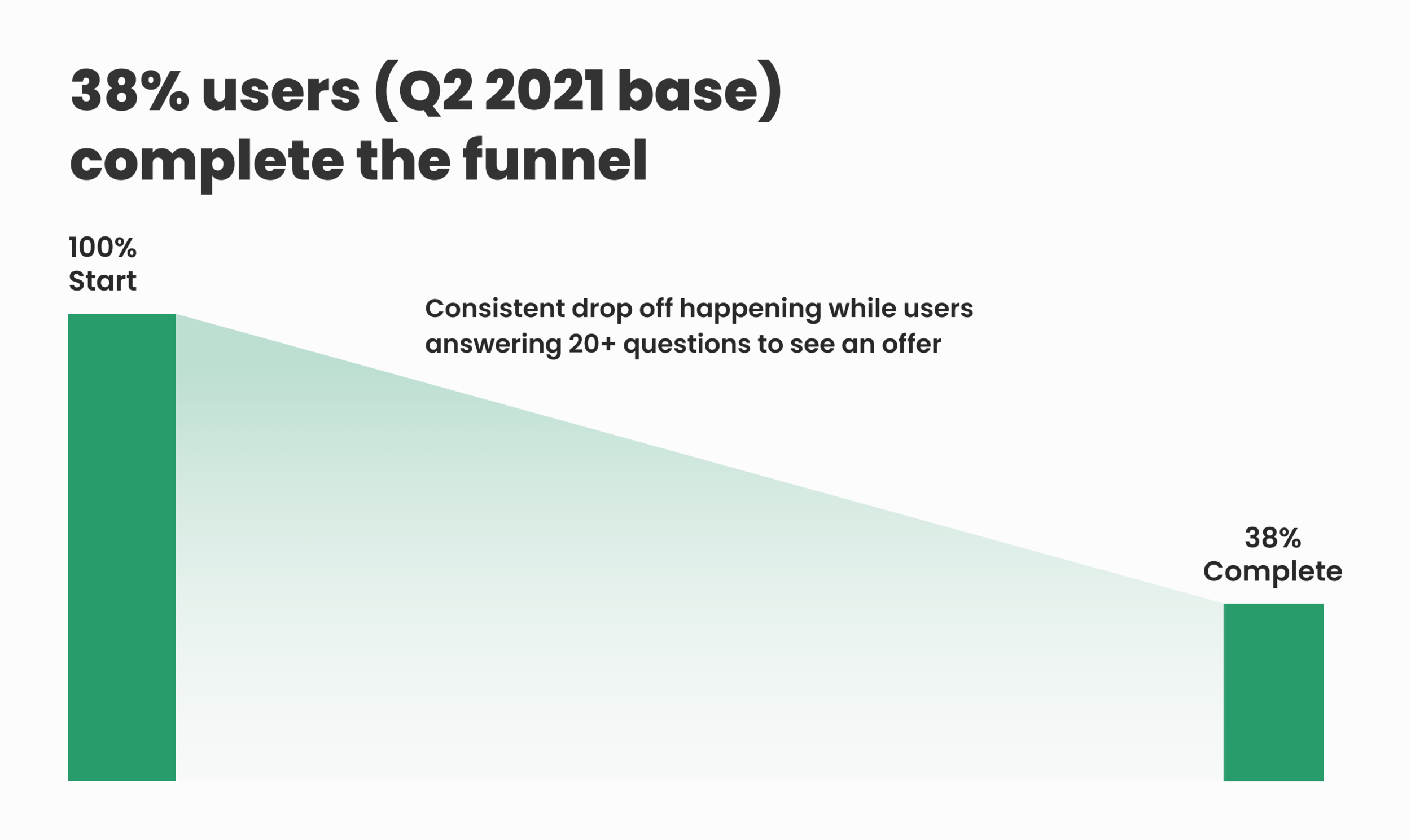
The SMB conversion from start to finish is 38%, and the team knew there is a lot of room to improve the funnel experience. So our team decided to overhaul the existing SMB loan funnel experience to improve conversion.
Research
I started analyzing the current experience and gathering data points of the drop-off. In addition, I conducted competitive research and stakeholder interviews to understand the pain points and discover what was working and what could be improved.
User pain points
01. Too many steps (20+) cause consistent drop-offs throughout the funnel
Users need to answer more than 20+ questions to get the offers. Drop off is happening through the funnels (38% conversion). Even some of the questions are not required by our SMB loan partners. The funnel has long steps because it’s also collecting user data to generate Personal loan offers in case we can’t find any SMB offers.
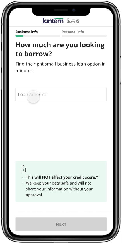
02. The funnel starts abruptly and does not address user concerns

The funnel starts asking what type of loan the user is looking for. We've heard feedback from many users that most of them are just getting started in the loan search process, so they are not familiar with these terms. In addition, selecting one loan type wouldn't even affect the loan offer they might receive. Another finding is most users are concerned about the potential impact of their credit score, data safety, and the time duration for the funnel flows. Unfortunately, the first screen doesn't address users top of the mind concerns.
03. Too many text fields create user friction and sliders lead users to input inaccurate values

We had 11 questions that have text input fields. Not many users enjoy typing their information on a mobile screen that leads to more friction and drop-offs. We had 6 questions that have a slider to input dollar amounts. From our partners, many users input inaccurate dollar amounts with the questions that use a slider component.
04. Question prompts are not very clear and user-friendly

Some of the questions prompts were not super clear. For example, “What’s your custom loan amount?” is not very intuitive to answer. In addition, some of the questions are not clear whether it has to be an exact value or can be a ballpark number.
Design solutions
After understanding the problem I set up design principles. The new experience will be
Simplify & reduce friction: Only ask for necessary information. Make it easier to input the user data. Adopt established UX patterns.
Build trust & confidence: Be transparent when explaining why we’re asking for sensitive information. Address any user concerns upfront.
Clear and straightforward: Build rapport with a friendly and personable tone. Be clear on what’s the next step.
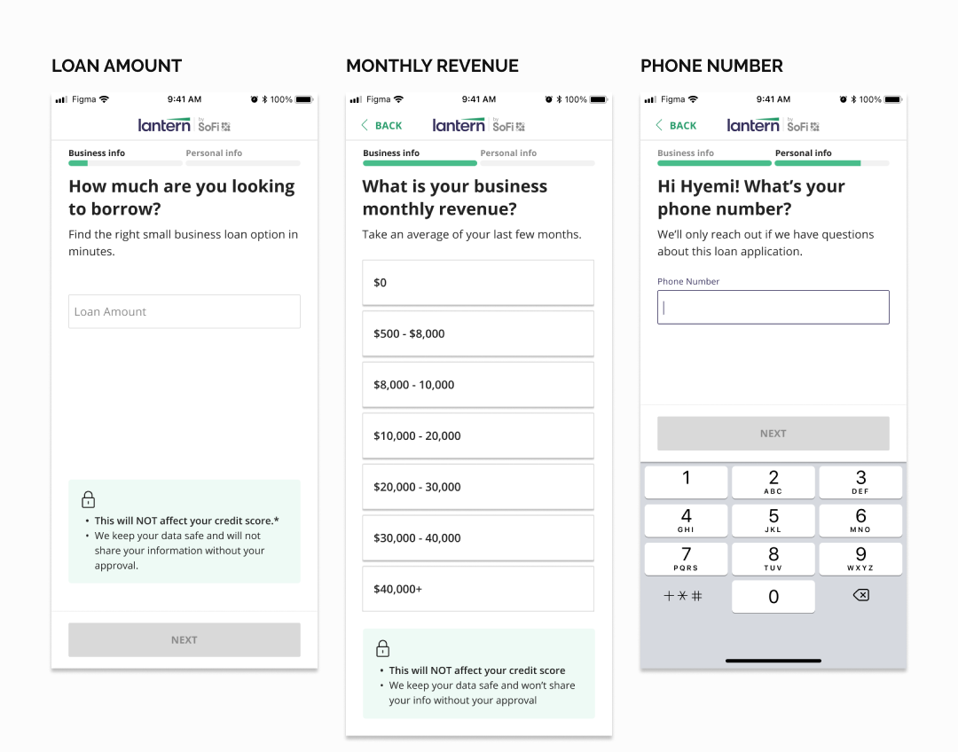
01. Simplify and reduce friction by removing unnecessary questions
We remove the questions to generate personal loans and have only necessary questions to generate SMB offers. In the end, we could reduce more than half of the questions.
02. Building trust and confidence by providing enough context and addressing any user concerns upfront will help users kick start the funnel
From the user research, I found out that when the users go through this kind of loan funnel they are concerned about
Their impact on the credit score
Data safety
Data sharing with 3rd party
On the screen, I display answers for those user concerns so they can start the funnel with peace of mind. In addition, I improve the question tone more personable tone and I’m clear about how the user should answer (exact value VS estimation)
03. Clear and straightforward interaction will help users to go through the funnel quickly and easily
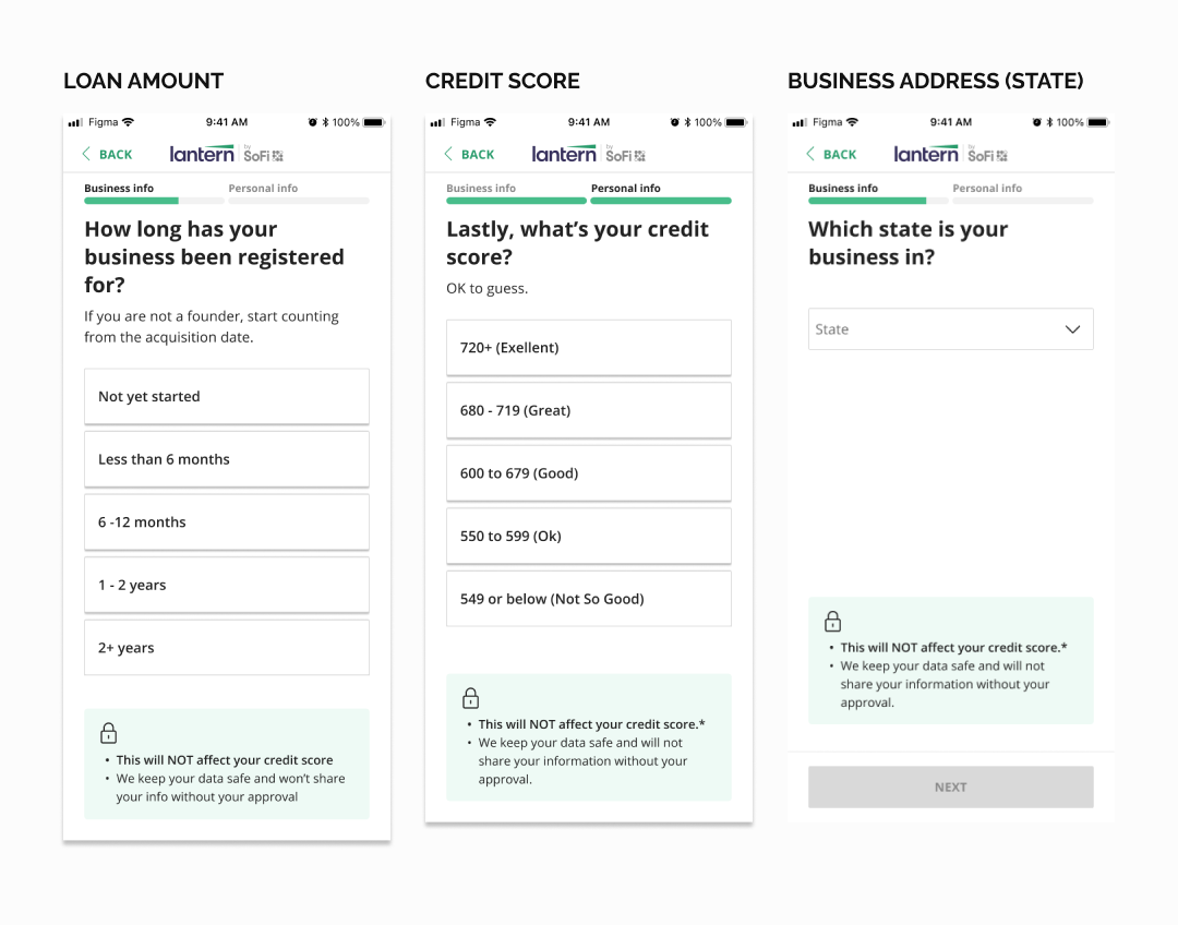
The Majority of Lantern users use their mobile phones to go through the funnel, and typing text fields with the phone is tedious work. I worked with our PM and engineers to find a way to provide a range instead of a specific value. In addition, we only ask for necessary information (ex full business address VS just state info). Furthermore, I get rid of the $ amount slider from the funnel to reduce the chance of receiving inaccurate data.
Impact
After the design improvement, the application's funnel completion rate has increased from 38% to 61%, resulting in record revenue for the SMB funnel. 🎉
Thanks for reading my case study!